
Convincing users to trust Spacebox with their belongings
By reimagining onboarding, plan selection, and checkout, we transformed hesitant first‑time visitors into loyal users who stayed, engaged, and ultimately committed.

Dakshita N.
8 mins
TOOLS
Figma, Miro, Mobbin, Claude, FigmaMake
team
Product, Engineering, Marketing
⚡️ the 30-second version
Spacebox is one of Hong Kong’s most established storage services: door-to-door collection and return scheduling, all through an app. But storage asks users to hand over their physical possessions to strangers. No feature matters until someone believes their stuff is safe.
I was brought in to fix a stalling sign-up funnel with no clear cause, and owned it end-to-end: from diagnosis, through redesigning three connected flows (onboarding, plan selection, checkout), to a roadmap recommendation.
A trusted, established brand whose app funnel was leaking with no agreement on why. My job: find the friction points and fix it, across a team of Engineers, QA, Marketing, Localization & Product.
33%
sign-up conversion
131%
first app opens, MoM
37.6%
selected a plan
400+
entered payment flow
My role & contributions
• Owned the problem end-to-end: diagnosis, the redesign of three connected flows (onboarding, plan selection, checkout), and a roadmap recommendation.
• Ran the diagnostic work, a walkthrough of every flow as a first-time user, a competitive scan on Mobbin, and a pattern search, then turned it into archetypes the team could design against.
• Drove alignment across Product, Engineering and Marketing on the contentious calls (delaying signup, moving checkout in-app).
• Designed and shipped the flows, and defined the Mixpanel funnel tracking that ended up reshaping the roadmap.
The opportunity
Spacebox is an award-winning storage service with a reputation. But the app asked people to pick a plan and a price before it had explained what the service even was. For a purchase where you hand strangers your belongings, that’s backwards: trust has to come first.
The funnel was leaking, and the team had different theories about where and why. Rather than redesign on a hunch, I started by finding the exact moments people hesitated, so the work solved the friction point instead of a plausible-sounding one.
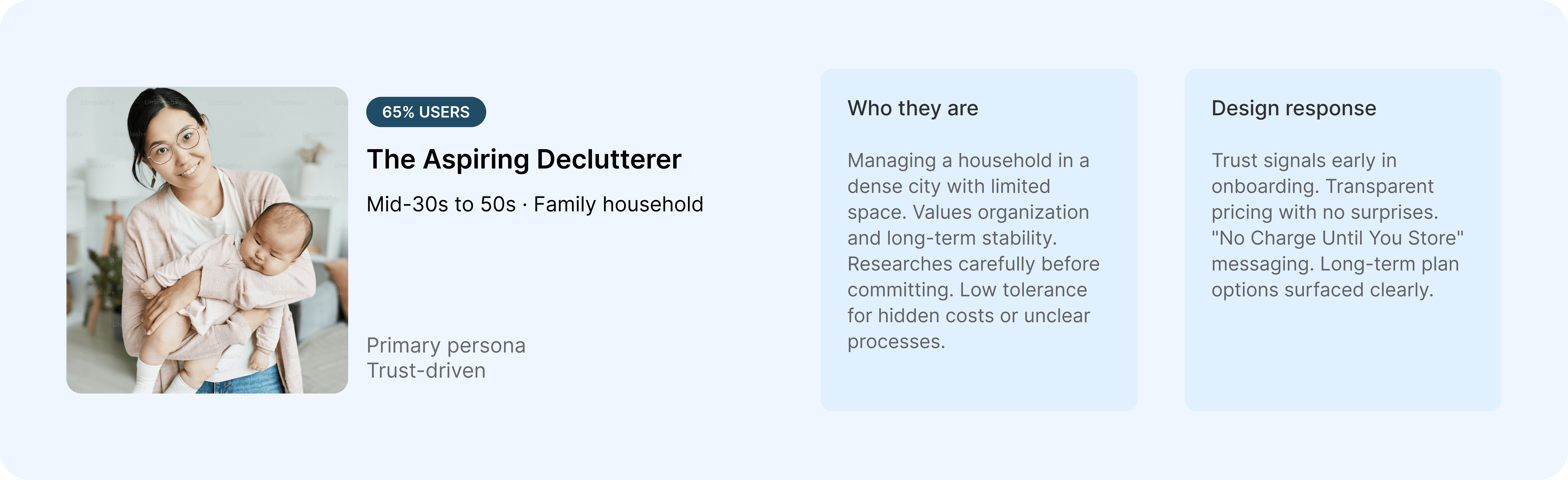
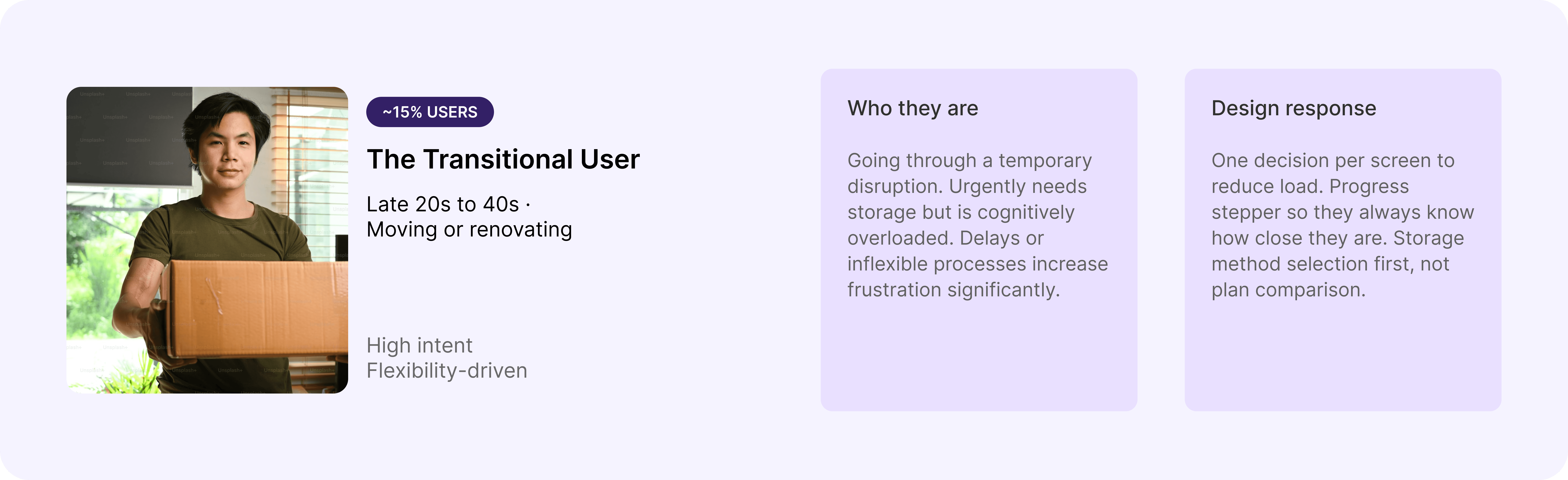
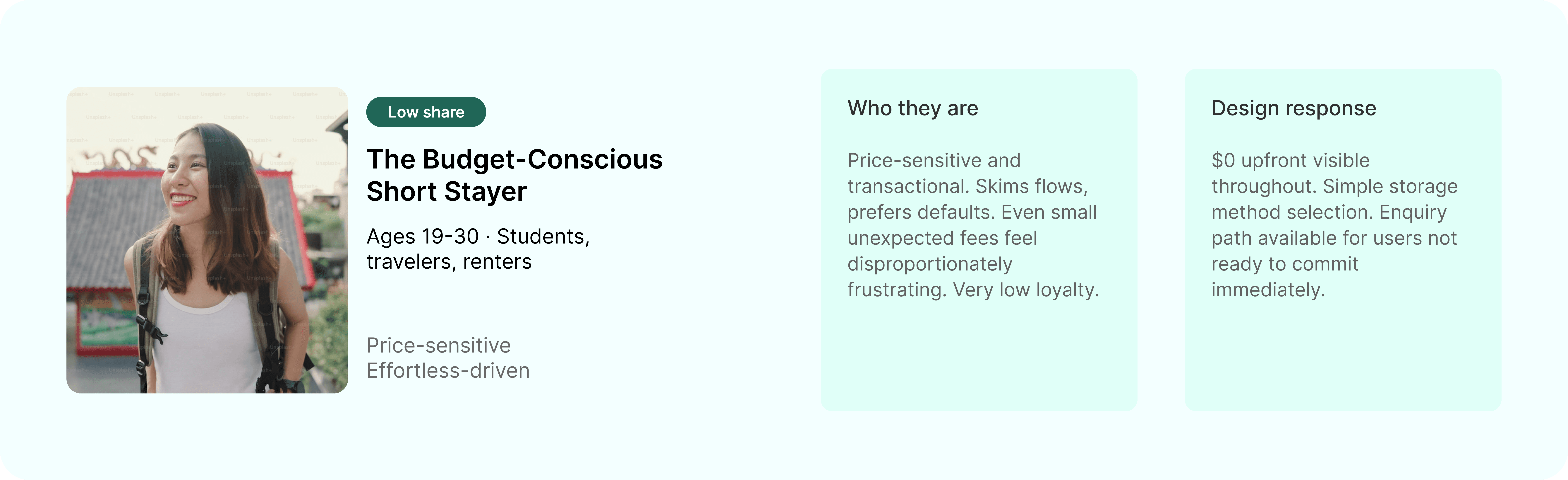
User archetypes for Spacebox
What most storage apps get wrong

Scanning storage and other high-trust service apps on Mobbin, the same pattern kept showing up: they lead with plans, prices and forms, and treat reassurance as something to bolt on later. Almost none of them show you what happens to your things, or who handles them, before asking you to commit.
What I anchored the redesign on
Reassure at the moment of doubt. Surface “$0 today”, “no upfront payment” and proof exactly where people hesitate, not on a separate page.
Earn understanding before asking. Explain the service and show how it works before any plan or price appears.
One decision at a time. A high-consideration purchase shouldn’t dump every choice on one screen; guide it one question at a time.
Where confidence broke

Mapping the old first-run, the hesitation clustered at a few specific moments: being asked to choose a plan before understanding the service, hitting a wall of options at once, and being pushed to a human handoff to finish. That map is what the redesign set out to fix.

The journey map from the diagnosis, friction flagged across onboarding, plan selection and checkout.
Rebuilding the journey



It was one first-run where each step had to earn the next.
Onboarding
Plans and pricing used to land on screen 2. I moved them back, leading with real photos and a clear “how it works,” then offering Order Now or Sign In.

Order
One overwhelming page became a guided sequence, one question per screen, with “$0 so far” shown throughout so no one feared a hidden charge.

Checkout
The old flow handed people to sales to finish. I added a self-serve, three-step Stripe checkout (“no upfront payment, $0 today”) and kept enquiry as a deliberate backup.

⚖️ Trade-offs I made the case for
Delaying signup and moving checkout in-app were both contentious. I used the drop-off data to win Product and engineering buy-in, optimising for whole-funnel conversion over first-tap speed, and kept the human enquiry path as a deliberate fallback so the team didn’t lose the relationship they valued.
After launch, the data told us something we didn’t expect

Once it shipped, I watched the Mixpanel funnel we had set up and the drop-off wasn’t in checkout at all. It was at the very moment of upfront commitment.
The checkout I’d rebuilt had worked, but the barrier was earlier and deeper: upfront commitment anxiety. That finding told us where to point the next phase.
💼 What this meant for the business
+33% sign-up conversion → more booked storage from the same traffic, a direct lift at the top of the revenue engine.
+131% first app opens → the onboarding redesign moved acquisition, not just usability.
Roadmap redirected → shifting to an enquiry-first model protects acquisition spend while we solve the real barrier.
Next steps ✨
The funnel finding reframed the roadmap. Instead of pushing more traffic into a flow that converts into drop-off, the team is building an enquiry-first model with deferred payment, so people can commit to the service before they commit a card. That’s phase two, in progress.
The immediate focus is validating these decisions at scale: watching how real users move through the rebuilt flows, and letting that, not assumptions, drive the next iteration. The lesson I’m carrying forward is to design for the trust people actually have, not the trust you assumed they’d arrive with.
Other Work


Redesigned help & support discovery, surfacing 60+ QA issues and halving the steps users took to find answers.

Like
spacebox
Share